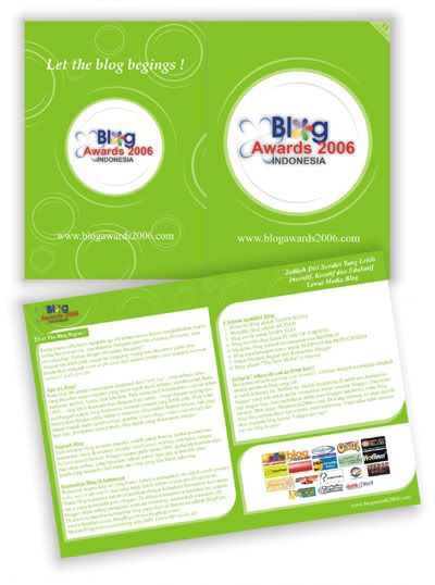
Brochure Designs
Wednesday, September 20, 2006 |by. admin |
 The key to making a professional brochure is to stick to the basics. These ten tips will provide the crucial elements for creating a professional brochure design:
10 Tips for Creating Professional Brochure Designs
What’s out there. Collect and study brochures from around the community. What makes one design more appealing than another? You can develop your sense of good design by carefully studying other designs.
Voice / Audience. Who are you trying to reach with your information, and how do you want to come across to them? Choose a font that will express the voice you desire (professional, humorous, casual…) and still keep your message clear. Avoid using more than two or three font styles, so as not to distract the reader from your message. Vary the font size of individual parts of the design according to their importance. Avoid excessive underlining, which can cause clutter and make text harder to read.
Less is more. What is the purpose of your brochure? Use the 'Brochure Checklist' to decide what information is necessary, and arrange the components of your brochure in order of importance. The clearer you are about the order of importance within your information, the better your brochure will be. Make sketches and move the various elements around. Try repositioning one or more elements to see how your design is affected.
Bars and boxes. Use bars and boxes sparingly. Boxes, borders and bars work well for directing one’s attention and separating busy areas--but too many can make your brochure design look cluttered or confusing. Explore other options for grouping and separating.
Negative space. Use 'empty' space to create a relationship between the contents and the page. Bring the specific information into focus on the page by adjusting the space around it. The amount of negative space in a design affects its overall tone of lightness or heaviness. As a person shouting in a noisy room stands out when the room suddenly becomes quiet, so does a word stand out on a busy page where the busyness suddenly stops.
Keep it simple. Keep your message in mind and include only those ingredients necessary to communicate the message. If you choose graphic elements to ornament your brochure, ask yourself whether they help to direct the reader’s attention, or simply create distraction.
Bigger, bolder and brighter. Once you have determined the relative importance and sequence of the particular components in your message, you will be ready to consider how to treat each of them. The most important items should obviously receive more of your reader’s attention. They should be larger, bolder, brighter, or in some other way made to stand out from the rest of your message.
Color. Color can be applied as ink on paper or as the paper itself. There are hundreds of paper colors available, yet some of the most effective brochures are done in only one or two colors. Black and white brochures can often be more dramatic than color. The cost of printing should be considered before making a color decision.
Paper selection. Paper comes in all sizes, colors, and textures. Ask your teacher about paper options. Using recycled paper can add an interesting flair to your brochure design, and it helps reduce the impact we make on our natural resources. However, using recycled paper can increase the cost of your brochure, because it is generally more expensive than regular paper.
Proofread! You should proofread your final design several times before having it printed. Once printed, it’s too late to fix an error that you didn't spot. Read lines backwards to check for errors. Step back and look critically at the overall layout.Labels: Brochure Design
 The key to making a professional brochure is to stick to the basics. These ten tips will provide the crucial elements for creating a professional brochure design:
 10 Tips for Creating Professional Brochure Designs
What’s out there. Collect and study brochures from around the community. What makes one design more appealing than another? You can develop your sense of good design by carefully studying other designs.
Voice / Audience. Who are you trying to reach with your information, and how do you want to come across to them? Choose a font that will express the voice you desire (professional, humorous, casual…) and still keep your message clear. Avoid using more than two or three font styles, so as not to distract the reader from your message. Vary the font size of individual parts of the design according to their importance. Avoid excessive underlining, which can cause clutter and make text harder to read.
Less is more. What is the purpose of your brochure? Use the 'Brochure Checklist' to decide what information is necessary, and arrange the components of your brochure in order of importance. The clearer you are about the order of importance within your information, the better your brochure will be. Make sketches and move the various elements around. Try repositioning one or more elements to see how your design is affected.
Bars and boxes. Use bars and boxes sparingly. Boxes, borders and bars work well for directing one’s attention and separating busy areas--but too many can make your brochure design look cluttered or confusing. Explore other options for grouping and separating.
Negative space. Use 'empty' space to create a relationship between the contents and the page. Bring the specific information into focus on the page by adjusting the space around it. The amount of negative space in a design affects its overall tone of lightness or heaviness. As a person shouting in a noisy room stands out when the room suddenly becomes quiet, so does a word stand out on a busy page where the busyness suddenly stops.
Keep it simple. Keep your message in mind and include only those ingredients necessary to communicate the message. If you choose graphic elements to ornament your brochure, ask yourself whether they help to direct the reader’s attention, or simply create distraction.
Bigger, bolder and brighter. Once you have determined the relative importance and sequence of the particular components in your message, you will be ready to consider how to treat each of them. The most important items should obviously receive more of your reader’s attention. They should be larger, bolder, brighter, or in some other way made to stand out from the rest of your message.
Color. Color can be applied as ink on paper or as the paper itself. There are hundreds of paper colors available, yet some of the most effective brochures are done in only one or two colors. Black and white brochures can often be more dramatic than color. The cost of printing should be considered before making a color decision.
Paper selection. Paper comes in all sizes, colors, and textures. Ask your teacher about paper options. Using recycled paper can add an interesting flair to your brochure design, and it helps reduce the impact we make on our natural resources. However, using recycled paper can increase the cost of your brochure, because it is generally more expensive than regular paper.
Proofread! You should proofread your final design several times before having it printed. Once printed, it’s too late to fix an error that you didn't spot. Read lines backwards to check for errors. Step back and look critically at the overall layout.
Labels: Brochure Design


1 Comments:
Wah keren...ijo.. *warna yg kusuka..
-blog.faniez.net-
Post a Comment
<< Home